How Brands Use Colors to Manipulate You - Page 2
- Colors signal product attributes like urgency, trust, or exclusivity in seconds.
- Brands strategically use color psychology to guide attention and shape brand identity.
- Color is a powerful first impression that frames how customers initially perceive a product.
How Brands Use Colors to Manipulate You
We like to think we shop with logic. We compare prices, read labels, and weigh features.
But long before any of that happens, color starts shaping how a product feels.
That is the quiet power of color psychology.
A brand’s palette can make something seem urgent, trustworthy, natural, premium, playful, or exclusive in a split second.
We often respond to those signals before we consciously judge the product itself.
That does not mean color works like magic or affects everyone the same way.
But in branding, packaging, and advertising, color is one of the fastest ways to influence perception.
Tale a look below on How Brands Use Colors to Manipulate You.
RELATED | Top 20 Most Mispronounced Words
RELATED | Top 10 Commercial Jingles Of All-Time
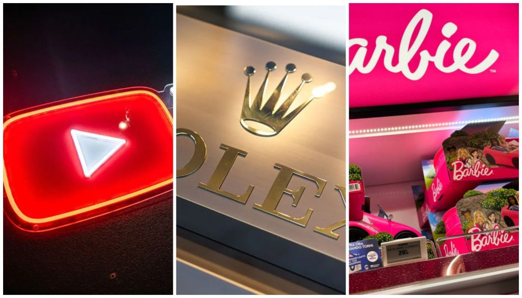
Red
Red grabs attention fast. It raises the sense of urgency and excitement, which is why brands often use it when they want quick action rather than slow reflection. It can also spark appetite and intensity, making it a favorite in food, entertainment, and sales-driven marketing.
Examples: Coca-Cola, YouTube, Netflix, Target, KFC

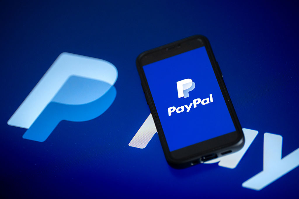
Blue
Blue tends to make people feel safe and steady. It signals dependability, which helps explain why so many banks, payment platforms, healthcare brands, and tech companies build their identity around it. When a brand wants to look stable and credible, blue is often the first choice.
Examples: Chase, PayPal, Visa, Facebook, Dell
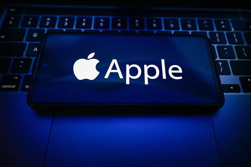
Black
Black gives products a polished, elevated feel. It can make the same item seem more expensive, more serious, or more refined simply through presentation. Luxury brands often use black because it suggests control, status, and exclusivity without saying a word.
Examples: Chanel, Nike, Prada, Sony, Apple packaging accents

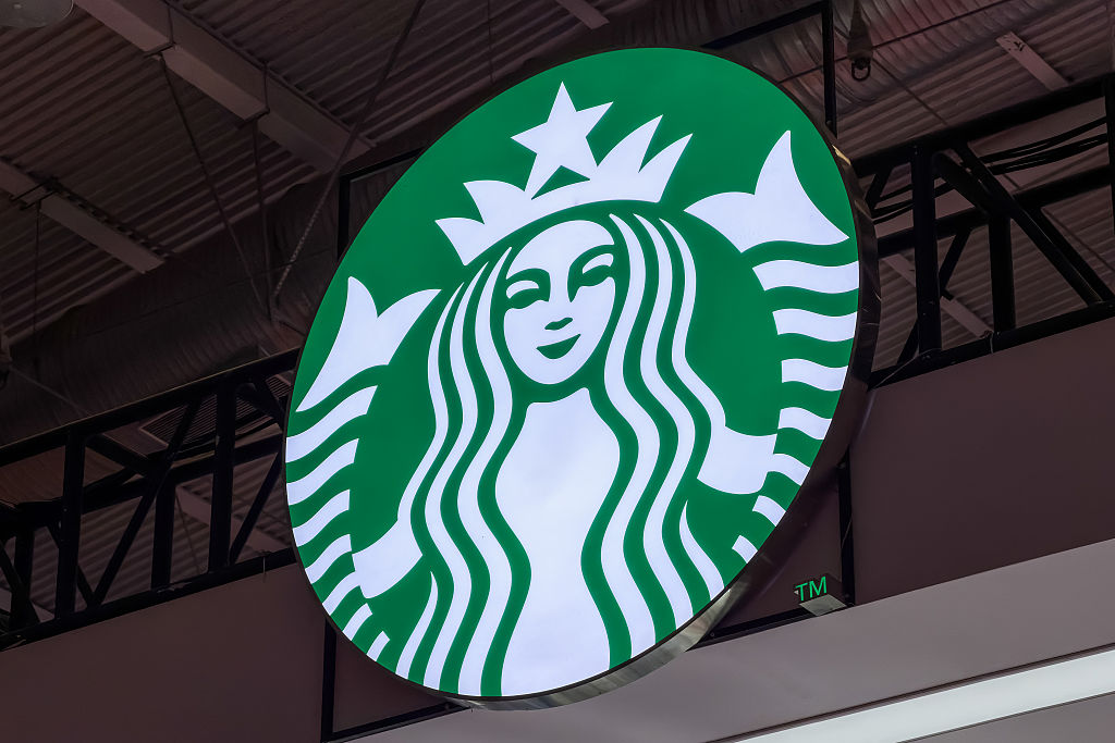
Green
Green is strongly tied to nature, wellness, and growth. It can make a product seem fresher, cleaner, or more wholesome before you even read the ingredients or claims. Brands in food, beauty, and sustainability use green to signal health and environmental awareness.
Examples: Whole Foods, Starbucks, Animal Planet, Tropicana green packaging, Seventh Generation
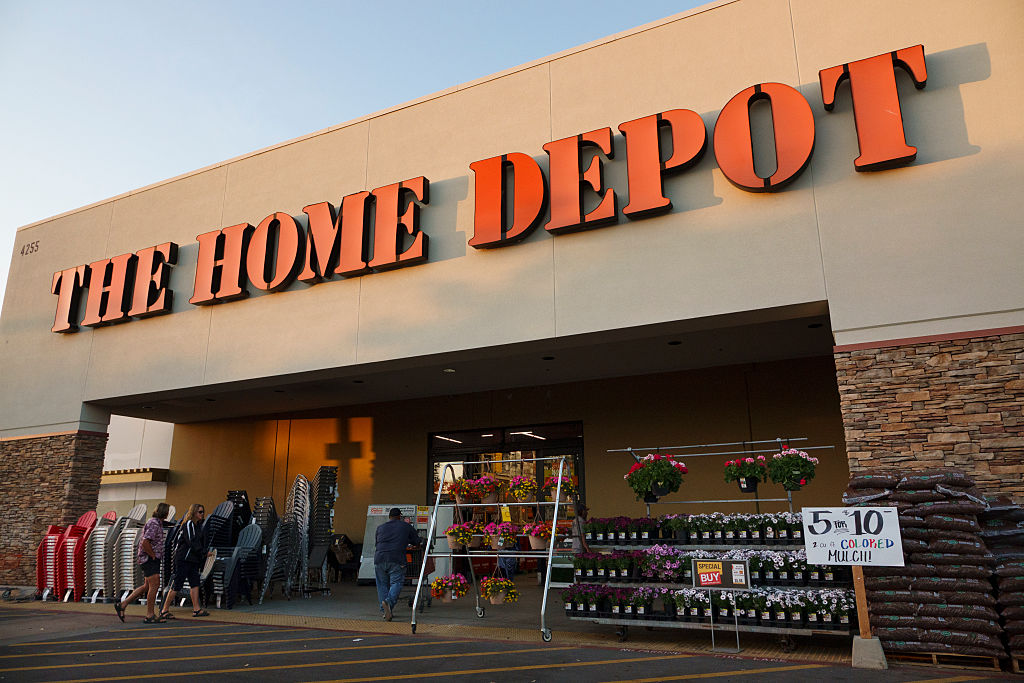
Orange
Orange feels energetic and friendly. It creates excitement like red, but usually with less pressure and less danger, which makes it useful for promotions, call-to-action buttons, and value-focused branding. Brands use orange when they want to feel bold, approachable, and hard to miss.
Examples: Home Depot, Fanta, Nickelodeon, SoundCloud, Amazon’s orange smile
Purple
Purple has long been linked to royalty, imagination, and luxury. In branding, it often makes products feel special, rich, or slightly mysterious. It works well when companies want to suggest indulgence, beauty, or uniqueness.
Examples: Cadbury, Hallmark, Yahoo, Twitch, Wonka

White
White creates a sense of space, order, and calm. It helps brands feel minimal, clean, and high-end, especially when paired with sharp typography or restrained design. In many cases, the empty space around a product is part of what makes it look premium.
Examples: Apple, Muji, Tesla interiors and branding materials, Dove packaging, The Ordinary
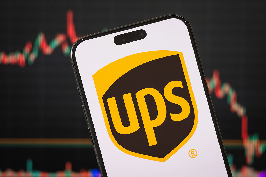
Brown
Brown signals warmth, stability, and a connection to the natural world. It can make products seem handmade, rustic, or more authentic, even when they are mass produced. Brands often use brown in coffee, chocolate, organic goods, and heritage-style packaging.
Examples: UPS, M&M’s chocolate branding, Hershey’s, Nespresso brown tones, craft coffee brands
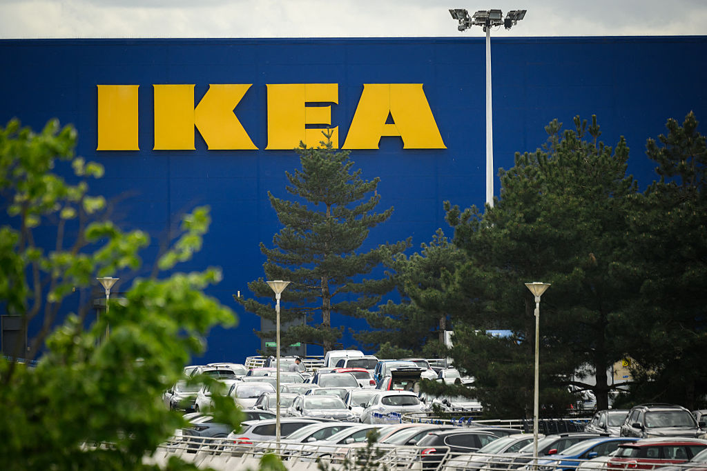
Yellow
Yellow is one of the easiest colors to notice quickly. It feels bright, cheerful, and friendly, which helps brands stand out on shelves and in ads. Because it pulls focus so well, yellow is often used to create a strong first impression.
Examples: McDonald’s golden arches, IKEA, Snapchat, Best Buy price tags, Lay’s
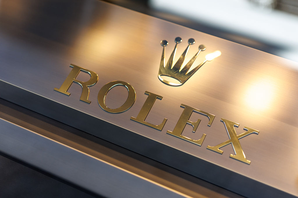
Gold
Gold carries a strong sense of achievement and class. It can make a brand or product seem elite, celebratory, or worth paying more for. Even small gold details in packaging can push a product into a more upscale category.
Examples: Rolex, Gold Peak, Lindt premium packaging, Cadillac emblems, award-themed brand designs
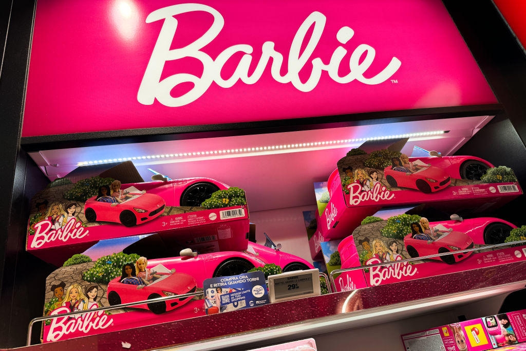
Pink
Pink often makes brands feel gentle, fun, and personal. Depending on the shade, it can signal sweetness, comfort, romance, or modern self-expression. Brands use pink when they want to create emotional closeness and make products feel more intimate or inviting.
Examples: Barbie, Victoria’s Secret, Lyft, T-Mobile, Glossier
Why color matters more than most people realize
Color is not a small design detail.
It is often the first message a brand sends, and it lands before a customer reads a headline, checks a feature list, or compares reviews.
That first emotional cue can shape whether a product feels safe, exciting, luxurious, natural, or worth trusting.
The strongest brands understand that color does more than decorate.
It frames perception.
When used well, it helps companies guide attention, support brand identity, and influence buying decisions in subtle but powerful ways.
So the next time a product catches your eye, pause for a second.
You may be reacting to the color before the product itself.