The Most Unsuccessful Business Rebrands
Cracker Barrel unveiled a brand new logo on Tuesday, dropping the familiar illustration of a man leaning against a barrel and opting for a clean, text-only design.
It’s the first time in nearly five decades that the brand’s logo consists solely of lettering.
When the Old Country Store chain first launched in 1969, its logo featured only text. The well-known image of the man and barrel wasn’t introduced until 1977.

In a statement, the company explained that the updated look “connects more directly to the signature barrel shape and wordmark that have been at the heart of the brand since the beginning.”
Many Cracker Barrel consumers weren’t happy when they saw that the iconic restaurant chain changed their logo. Many complained that the removal of the old man and the barrel took away the charm of their aesthetic.
Here is a list of unsuccessful rebrands that received similar reactions from the public:
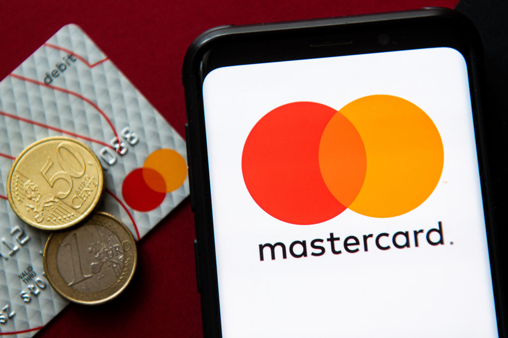
1. Mastercard (2006)
-
Tried to simplify its overlapping red/yellow circles into a sleeker logo.
-
Met with confusion and dislike, forcing a return to the classic.
-
(They later succeeded with the 2016 minimalist version.)
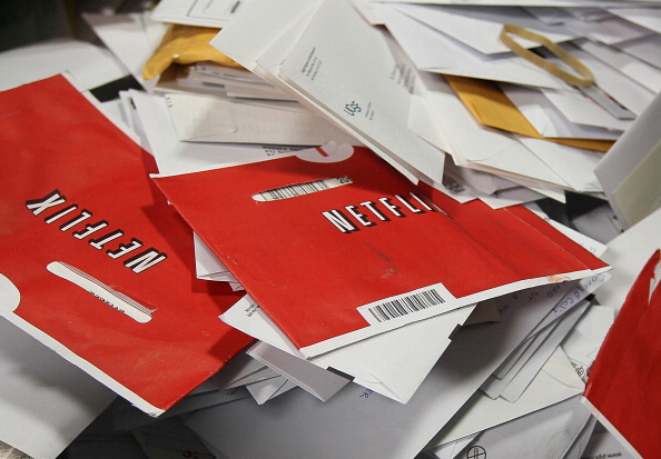
2. Netflix → “Qwikster” (2011)
-
Tried to split DVD rentals into a separate brand.
-
Customers hated the confusion of two sites/accounts.
-
Reverted in under a month.
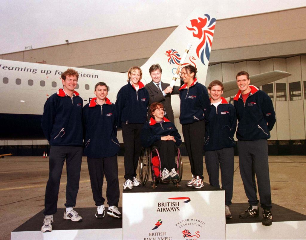
3. British Airways (1997)
-
Dropped the patriotic Union Jack tail design for abstract “world art” motifs.
-
Seen as erasing British identity.
-
Margaret Thatcher famously covered the logo with her handkerchief.
-
Eventually abandoned the rebrand.